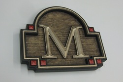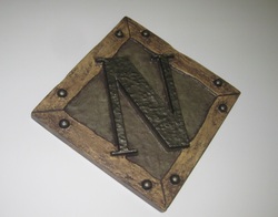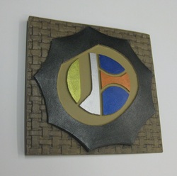
The basic design was fairly simple.
The frame was artwork that I was able to import from "Smart Art Sign Layouts".
Then I tweeked it a bit and whala. The problem "I" created was I should have worked the reliefs more. I didn't give myself many good sharp raised edges to paint to so the painting process was very Tedious.
Oh Well Live & Learn.

Up to this point when picking colors my first thought is Contrast, Here I went a little suttler and the result seams to work and work well.

The font here is an Old English Font.
The Base relief is the weave texture from Dan Sawatzky's texture magic collection, applied to a slightly domed relief.
The "O" was sloped using a fadded bitmap also From Dan's Collection.
It's hard to pick up in this photo but look close and you'll see that the "O" is thicker on the right than the left.

 RSS Feed
