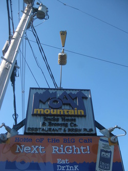
After Installation I didn't like the way the "Smoke House & Brewing Co" Text read.
After all that is the most important part of the message.
I tried repainting and changing the colors (which helped) but I still was not satisfied.

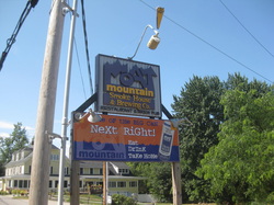
The only way I could see to accomplish this was to make a panel with the enlarged text on it and secure it over the smaller text.
And Here are the results. This reads much better from the road at 35mph.
My Goal was to make a sign that the Owner could get 10 years or more out of this sign and I wanted him to be happy with this sign for that entire period of time.
Now I'm Happy and hopefully better educated as to what is really important
on a sign.

 RSS Feed
